At a time when nearly every show can achieve technical perfection, Apple TV’s Cape Fear pursued something harder: a look that felt unpredictable, unstable and alive. For cinematographer Eben Bolter, that challenge began with a simple question: “When everything looks good, how do you make something not just look different, but feel different?”
Bolter and the creative team leaned into what made the story psychologically unsettling, creating an image where humidity hangs in the air, shadows threaten to swallow the frame and every scene feels charged with tension. It is, in every sense of the word, sweaty.
Achieving that look demanded far more than an aggressive color grade after photography wrapped. It required a visual philosophy that began months before production, guided every creative decision on-set, and continued through finishing. Together, Bolter, Harbor supervising colorist Damien Vandercruyssen and Harbor senior colorist Roman Hankewycz built a workflow that continually pushed the image toward its breaking point before carefully pulling it back again.
Building the show before day-1
For Bolter, post production should never be where a show’s visual identity is discovered.
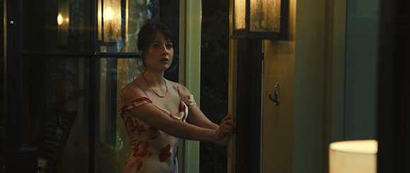
“I’m a really big believer in testing,” says the cinematographer, who shot the series using Arri’s Alexa 35. “I want the image on the monitor on day-1 to already be the show.
Weeks before principal photography, extensive camera, lighting, costume and makeup tests became the foundation for a single show LUT that established the visual language of Cape Fear. Rather than creating multiple looks for different environments, the team developed one flexible photographic foundation capable of adapting throughout the series without ever abandoning its identity.
The LUT became more than a preview transform. It became the show’s digital film stock.
“We wanted everybody – from producers to executives – to know exactly what the show looked like before we started shooting,” says Bolter.
Preparation didn’t stop there. Throughout production, Bolter reviewed stills from every shoot day, arranged in episode order, rather than scene order, looking at the emotional progression of entire episodes instead of isolated shots.
“You zoom out,” he explains. “Maybe we’ve leaned too warm for too long. Maybe this sequence needs more contrast. Hopefully no two scenes ever feel exactly the same.”
That philosophy would shape every decision that followed.
Photographing heat instead of color
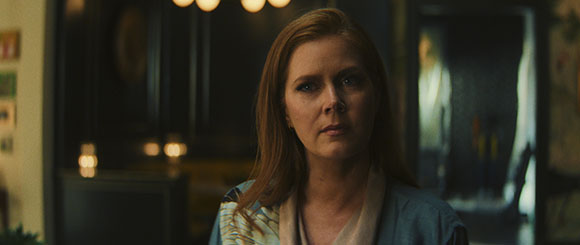
Surprisingly, the biggest visual reference for Cape Fear wasn’t another film - it was Savannah, GA itself. After arriving from a shoot in cool and dark London, Bolter was immediately hit by the dramatic environment of the American South.
“The trees are sweating,” he remembers. “It’s either raining or about to rain. Even on sunny days, there’s always thunder in the distance.”
Rather than photographing Southern heat in the traditional sense, showcasing dusty yellows and sun-bleached landscapes, the team wanted viewers to feel humidity itself. The air needed to feel heavy. Skin needed to appear warm without becoming artificially red. Greens needed to feel alive without drifting into fantasy. The audience needed to sweat.
Scorsese’s original film inevitably entered conversations, but Bolter resisted treating it as a visual blueprint.
“The original isn’t afraid to be expressive,” he says. “That gave us permission to push.”
One question continually resurfaced during prep: How warm can skin become before it stops feeling believable? Answering that question became one of the defining creative challenges of the grade.
Pushing the image to the breaking point
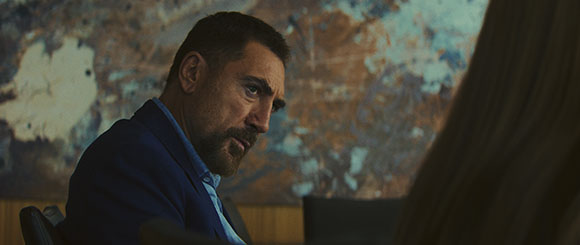
Looking at Cape Fear, it’s tempting to assume the look simply came from increasing saturation and contrast. In reality, the image was built through restraint. The team at Harbor used FilmLight’s Baselight system to perform the grade.
“We wanted to push everything,” Vandercruyssen explains. “Contrast and saturation, yes, but then we worked on the S-curve so it still felt filmic. We broke the image, but then we repaired it.”
Rather than creating one aggressive transform, the look development separated contrast, color distortion, highlight rolloff, HDR response and tonal mapping into independent components. That allowed each characteristic to be pushed individually without destabilizing the image as a whole.
“It isn’t just turning every knob all the way,” Hankewycz explains. “Every image was built incrementally. You push it. Then soften it. Push it again. Then soften it again.”
That restraint became critical. Even though Cape Fear is considerably richer and more saturated than much of contemporary television, skin never becomes garish. Greens remain vibrant without contaminating flesh tones. Highlights retain intensity without clipping. Every creative decision
pushes the image toward instability before another gently softens it. Each layer buffered the next, creating what Bolter describes as “soft buffers on a very aggressive approach.”
The result is an image that never feels processed. Instead, it captures what it means to be imperfect and uncomfortable.
Marrying two episodes into one continuous moment
One of Hankewycz’s favorite creative challenges arrives at the end of an episode. A confrontation begins at dusk before continuing seamlessly into the opening of the next. For the audience, it plays as one uninterrupted emotional sequence. From a finishing standpoint, however, it became one of the series’ most technically-demanding moments.
“Anything around golden hour is challenging,” Hankewycz explains. “That window is very quick. You’re chasing light and trying to balance things out. Some things are way too bright. Some things are way too dark.”
His challenge wasn’t simply matching exposure between shots, but also preserving the feeling that time had never been interrupted. Golden hour naturally pushes an image toward ambiguity. The time itself is so fleeting that details disappear. Contrast shifts by the minute. Darkness begins to take over, yet the audience still needs to understand where to look.
Rather than forcing technical consistency onto every frame, Hankewycz graded toward emotional continuity. The audience isn’t thinking about changing exposure or the mechanics of production.They’re thinking about the confrontation itself. That’s exactly where he wanted their attention.
Darkness should stay dark
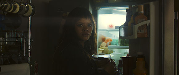
Perhaps the boldest creative decision throughout Cape Fear is what the team refused to do: They refused to brighten the shadows.
Modern television often treats darkness as a technical limitation, guided by concerns that the audience won’t be able to see an image. Cape Fear treats darkness as storytelling.
“I wanted the light itself to feel dangerous,” Bolter says.
Characters repeatedly move between harsh sunlight and complete silhouette. Faces disappear as
they step outside practical sources. Interiors are illuminated by reflections off water, narrow windows or slivers of practical light instead of broad, even illumination.
“If you step into the light, you may be safe, but you are extremely exposed,” Bolter explains. “But if you step out of the light, you’re subjected to what or who resides in the darkness.”
Hankewycz embraced that philosophy throughout the grade. Rather than globally lifting shadow values simply because modern cameras captured the information, he selectively revealed only what the story required. Shadow detail still exists within the image - it simply isn’t always given to the audience.
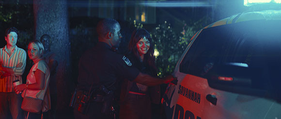
That philosophy is especially clear at the end of the first episode, when the characters gather at night by the swimming pool. Bolter wanted the scene to feel unstable, using the pool and light filtering through the trees to create an environment filled with movement while allowing people to disappear into darkness.
Rather than separating the actors from the environment with controlled, flattering illumination, Bolter deliberately resisted the safe choice of putting a soft light on the actors. Instead, the characters had to exist within the same unpredictable lighting conditions as the world around them.
“It will be dark,” he recalls, “but that’s okay. It’s going to be imperfect.”
Perspective creates suspense
When crafting fear, color is only half the equation. Perspective is what turns Cape Fear into something psychologically unsettling.
From the earliest conversations, Bolter wanted the camera to blur the line between objective observation and subjective experience. Rather than clearly signaling when viewers were seeing events through a character’s perspective, the series constantly shifts between detached observation and emotional subjectivity.
“I always wanted there to be that question,” Bolter explains. “Are we objective? Or are we suddenly inside somebody’s head?”
Those transitions are rarely announced. Instead, they happen through lensing and composition. Wider frames slowly compress into longer focal lengths. Intimate close-ups unexpectedly give way to expansive wide shots that leave characters isolated inside their environment. Long, creeping zooms subtly reposition the audience without drawing attention to themselves.
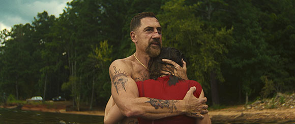
Bolter points to a sequence they filmed under extremely unforgiving conditions. During a scene in the water, repeated lightning strikes forced production to stop again and again. Each strike sent the crew scrambling out of the water before waiting for another brief safety window. When the opportunity finally came, everyone rushed back into position.
“I’m pretty sure we only got one take,” Bolter recalls. “It ended up being perfect.”
Trusting the audience
Throughout production, one question continued resurfacing: What makes an image different? For Bolter, the answer isn’t technology - it’s rejecting hesitation.
Modern cameras are capable of extraordinary images. HDR offers unprecedented latitude. Digital grading tools provide almost limitless control, so the challenge isn’t creating beautiful pictures – it’s having the confidence to push beyond them.
That confidence shaped every stage of Cape Fear. Bolter challenged conventional cinematography. Vandercruyssen established a look capable of surviving extreme creative decisions. Hankewycz carried that philosophy across the series, preserving its emotional consistency while allowing each episode to breathe on its own.
Together, they created an image that rejects technical perfection in favor of emotional precision. Humidity becomes a character. Darkness becomes narrative. Perspective becomes unstable. And characters, but not images, fall apart.