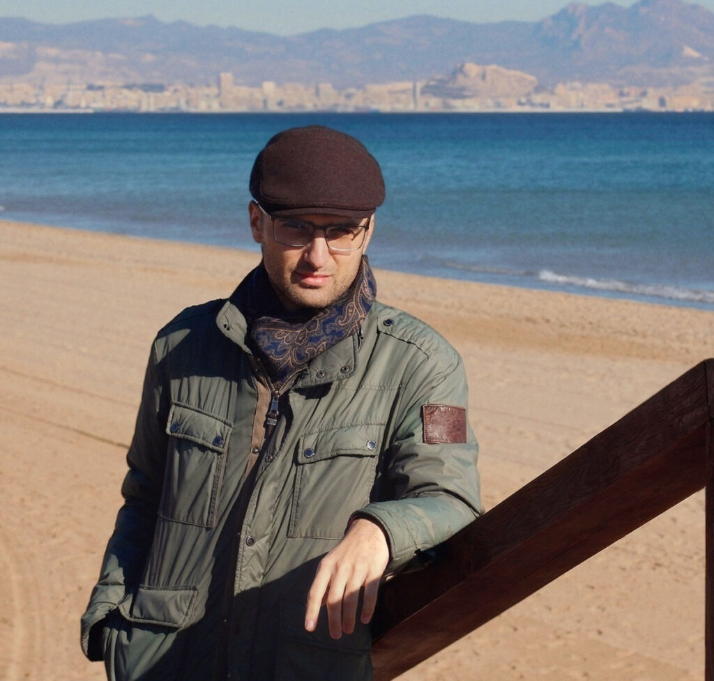
The career of WeMakeColor’s Raúl F. Ballester spans Spain and Mexico, where he has worked across commercials, short films, music videos and television. His advertising credits alone include work for Lexus, Amazon, Palacio de Hierro, Adidas, Honda, BBVA, Aeroméxico, Corona and Maestro Dobel. A long-standing member of the studio’s international roster, Ballester first began collaborating with colorist/founder Felipe Martínez U. in 2017, bringing a creative approach shaped by his early love of painting, photography and cinema.
Here, Ballester reflects on his journey into color grading, the challenges of creating distinctive looks for advertising, his favorite narrative projects and why listening is one of the most important skills a colorist can develop.
How did you first find your way into color grading? Was there a particular moment when you realized it was what you wanted to do?
“Ever since I was a kid, I’ve been drawn to painting and cinema. I started at a painting school in Alicante when I was 10. What really pulled me in and motivated me were the trips my parents, my sister and I used to make to the Museo Reina Sofía back in the ’90s.
“As a teenager I’d go into a kind of ecstasy watching films by the Italians, Bertolucci and Antonioni. With Bertolucci, it was the atmosphere that got me: that decadent, twilight feel of The Conformist, Last Tango in Paris and 1900. With Antonioni, it was Red Desert and Blow-Up.
“After finishing my degree in Media Studies in Barcelona, I’d become more interested in storytelling and rhythm, so I decided to study editing at ECAM in Madrid. That’s where I started working with cinematographers who wanted to touch up their first works and short films with the color tools in Final Cut Pro and Avid. It was around then that I first heard the word ‘etalonaje,’ the Spanish term for grading.
“After finishing film school, I decided to launch my professional career in Mexico in late 2008. I kept working as an editor for years, but my move from editing into grading happened gradually. There was no sudden epiphany. I started getting interested in the color work on the projects I was cutting, and at some point color took over. What I can say is that I became a colorist for good in Mexico.”
You’ve worked across both Spain and Mexico. How have those different markets influenced you creatively?
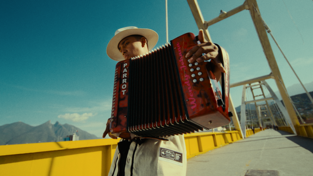
“My work in Spain is mostly narrative: a feature and several short films I’ve done for the production company Cautiva y Desarmada. Most of my career has been in Mexico, and there I’ve been able to do a bit of everything: short films, music videos, series and, above all, commercials.
“My process doesn’t change much. The main difference is that on my Spanish projects, we usually go for a naturalistic, unobtrusive style. The pace is also calmer in Spain. In Mexico, the advertising industry runs on a particular kind of urgency, so the pace is much faster.
“For a while now everyone’s been after the same things: underexposure, dense colors and a filmic texture. It’s a sign of the times, and I’ve done plenty of it myself, but I’m starting to notice some early signs of fatigue.”

Much of your work has been in advertising. What do you enjoy about grading commercials, and what are the biggest challenges?
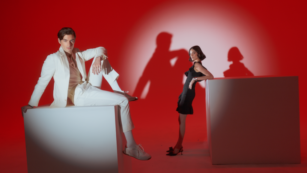
“For me, the most interesting thing about advertising is how short it is. I’m constantly switching techniques and approaches, so I don’t get boxed into one style. Some people say they can spot a style or a tendency in my work, but I reject that idea. I can lean towards a more natural style, or maybe a bolder one. In advertising, one of the most important skills is knowing how to be a chameleon. You adapt your tastes and your aesthetic leanings to what the brand is after, rather than strutting around like a peacock. In film, though, what matters most for me is sensitivity. Subtler things come into play there, like ambiguous feelings or our own contradictions.
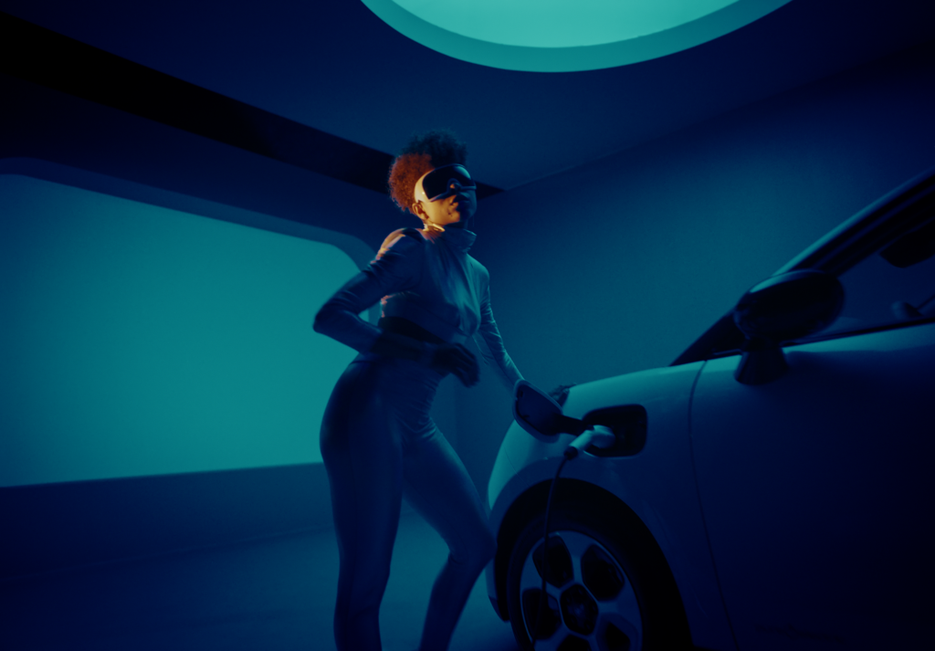
“Creatively, the biggest challenge in advertising is getting a great look and carrying it across every shot in the little time you have. Speed comes with the job. I’ve even had to deliver a 14-minute short in four hours. Technically, the hardest part for me is managing windows and masks. I’ve explored new node structures and ways of working just to get better at handling keys and windows.”
How do you approach finding the visual identity of a new project?
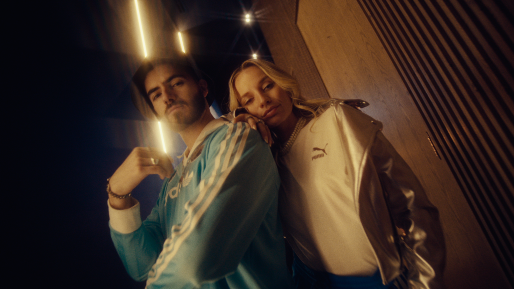
“By listening. I almost always get sent references. Advertising is a very reference-driven world: people want to emulate other commercials, films and music videos.
“Over time, though, I’ve come to really value it when people just talk to me. The references tell me roughly where they want to go, but I also ask them to put what they’re after into words. I think people underestimate the power of words, even when what they’re expressing is doubt.”
How do you balance creating a striking look with protecting product colors and brand identity?
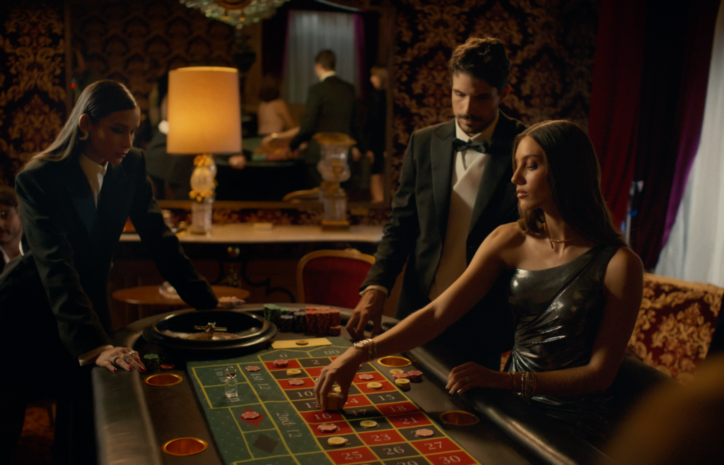
“One of the most important decisions I make is which tools to use for the look, based on the product being advertised: its colors, how often it appears, and whether it’s shown in a very dynamic or a static way. In general, however bold a look you’re going for, as long as you’re in control of what’s happening, you can protect or correct the product colors. The danger is when the look dictates the luminance of the colors too much and darkens the product tones too far. That’s hard to undo, so you have to take a different route.
“Tonal transitions can also get tricky in shots with a very shallow depth of field. The out-of-focus areas can cause banding or gradients that aren’t smooth. In those cases, I always start from a very clean base with a few simple dance steps. Then the dance of colors gets more complex, but I try not to let it turn into a witches’ sabbath that would ruin the product.
Beyond that, I’m pretty pragmatic. However much witchcraft you try to work into the look, in the end the Holy Inquisition has the last word, and quite often somebody ends up burned at the stake. Not me, though.”
You’ve described La Mirada de los Condenados, graded at WeMakeColor, as one of your favorite narrative projects. What made it special, and how did you approach the look?
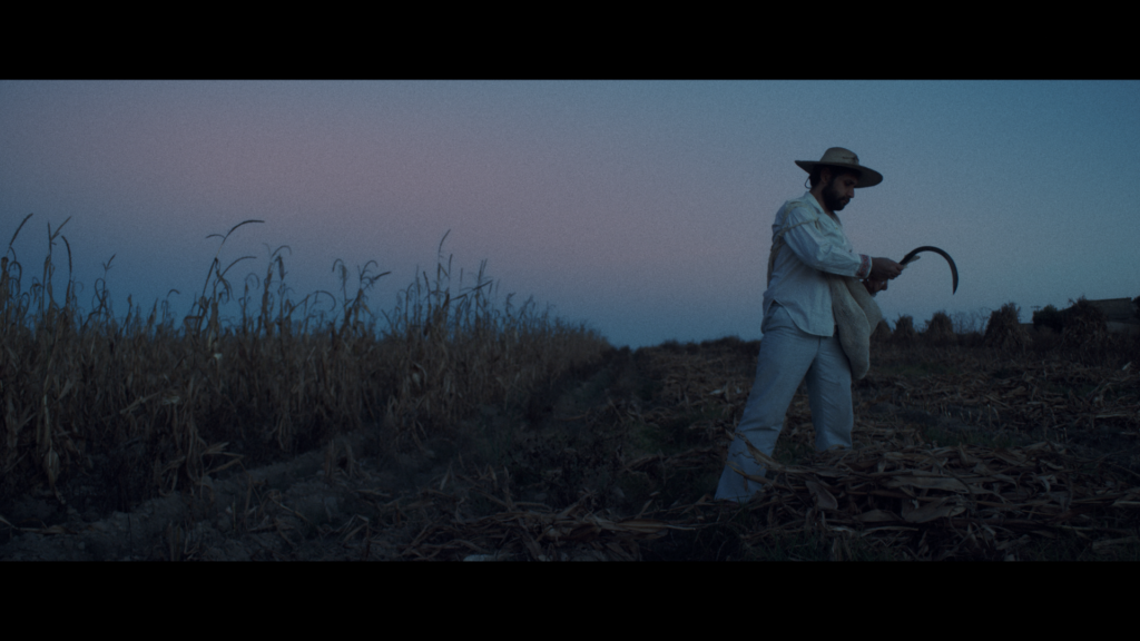
“Felipe told me the DP wanted an ’80s look, since that’s when the story takes place. It was a six-episode miniseries with a terrific script and solid, convincing performances.
“It was one of my first projects in ACES, so I didn’t use any LUTs. My tools were color temperature and curves. With the curves I pulled a bit of red out of the highlights and cooled the shadows slightly. I also added contrast in the highlights to bring out more detail. Felipe took care of designing the grain.
“I think the grade gave the characters and the spaces more volume and density overall. It helped create a slightly suffocating atmosphere without losing the color nuances in the costumes and production design that capture the look of that era.”

You’ve worked with Felipe and WeMakeColor for almost a decade. How did that relationship begin, and what do you value about the collaboration?
“I got in touch with Felipe about nine years ago, in August 2017. He soon started offering me projects, mostly music videos and short films at first, and a couple of years later, La Mirada de los Condenados.
“Felipe included me in WeMakeColor from the start, when it was just beginning to take shape, and he trusted me completely from day-1. WeMakeColor has always been a collaborative project. In our chats and group meetings we share techniques and ask each other questions. Recently, we also took a Baselight course with Andy Minuth, which WeMakeColor and FilmLight organized together in Mexico City.”
Tell us about your setup and some of the tools you rely on?
“I work in DaVinci Resolve. My reference monitor is a Flanders Scientific DM240, and I use ScopeBox for my waveforms, fed directly from the monitor.
“One important tool I use all the time is a fairly complex script I built with Claude Code. It’s saved me hours of work, because on bigger campaigns it lets me set up multiple timelines with different presets quickly and very flexibly.”
Of all the projects you’ve worked on, which best represents you as a colorist, and why?
“La Mirada de los Condenados is a good candidate, but in general I’m really drawn to narrative projects – I mean the ones where the story grabs me and the characters are real, flesh-and-blood people with a soul, far from stereotypes and preset formulas.
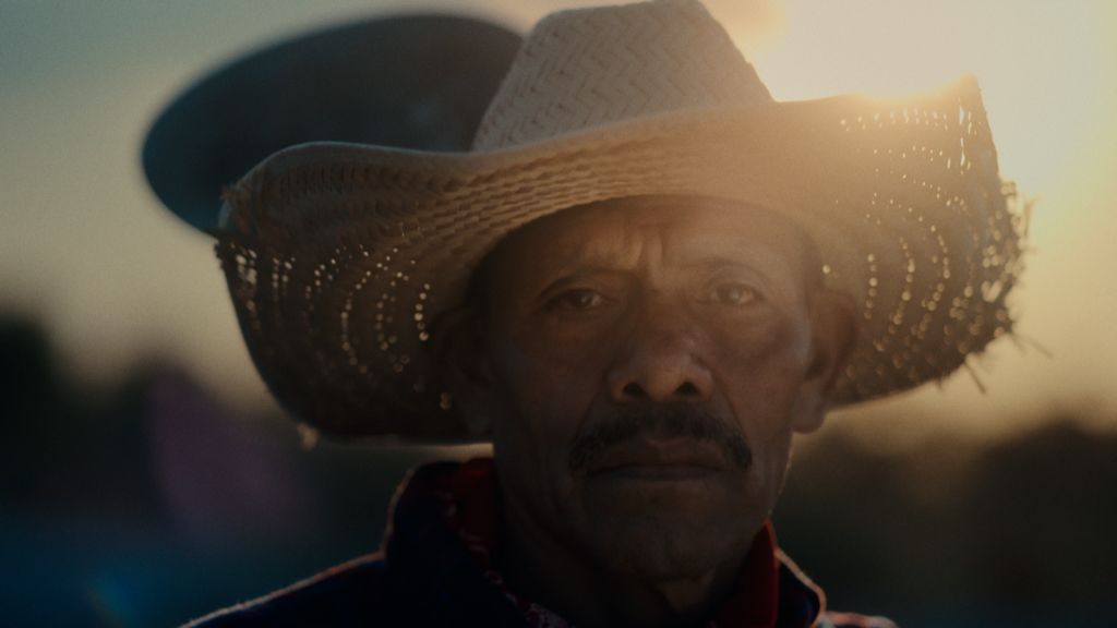
“The short films I’ve graded for Cautiva y Desarmada and for Perro Negro Cine are stories whose images I like to linger on. Sometimes it’s just the expression on a face or the way a character moves. I play it back again and again, and I think of color as a thin layer of skin or dust that makes everything more real and more present, and makes the characters more physical.”
What’s the hardest part of being a colorist, and what’s the most rewarding?
“There’s a certain instinct a colorist sharpens over time. I mean the intuition to know what visual style the person in charge of the project wants, when to push the look further and when to hold back, and how to read a director’s creative intentions quickly.
“All of those skills build up into a kind of receptive, visual wisdom that can only be shaped over time, through working with lots of different personalities and very different kinds of projects. For me that’s the hardest thing to reach, because it can’t be taught, so you can’t learn it quickly. Only time and experience give you that.
“There are two moments I love most in the process. The first is when you suddenly find the key to the look you’re after, as if you’d found the last piece of the puzzle. The second is when they tell me ‘approved.’ That’s when it’s time to prepare the deliverables, relax and wait for the next dance.”